Color Identifier Color Finder
- 4.4
- Rating
- 50.00K
- Installs
- Free
- Price

 Analysis by App-foxy
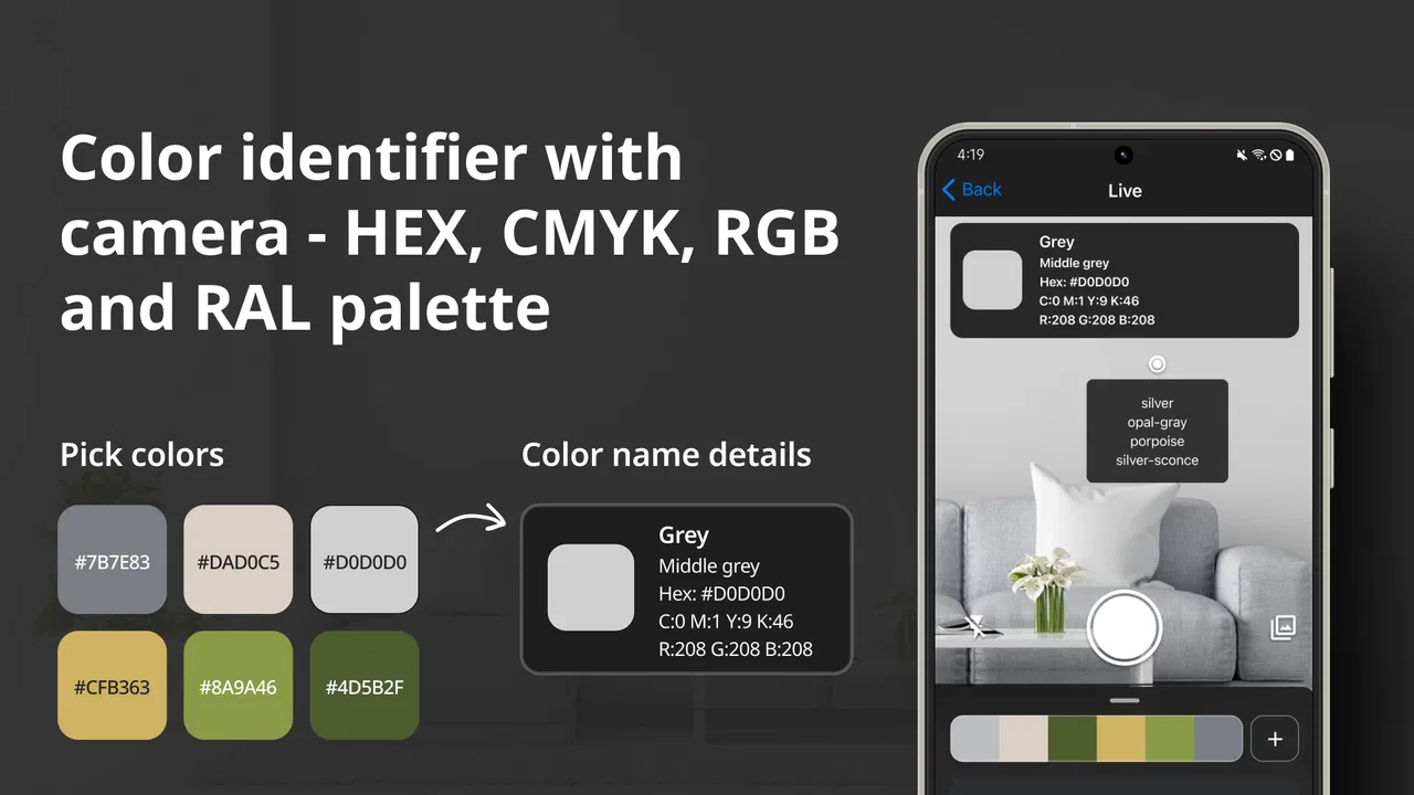
I downloaded Color Identifier Color Finder expecting a simple camera utility, and that is exactly where its appeal begins. It belongs to the Art & Design category, comes from AppCraftingMinds, and focuses on turning a color you can see into a more usable reference. The idea is easy to understand: point the app at a shade, inspect its identity, and work with color values such as RGB, HEX, CMYK, or RAL.
That sounds modest, but it solves a real everyday problem. I have often seen a wall, fabric, illustration, plant pot, or printed sample and wanted to know what color it actually was. Human descriptions such as “warm blue” or “slightly muted green” are too vague when I need to recreate the shade. This app gives that moment a practical next step instead of leaving me to guess.
My first impression was positive because the app does not require me to understand color theory before using it. It is aimed at ordinary users as much as designers, and its Everyone age rating fits that approachable character. The free download also makes it easy to test without committing money immediately, although optional purchases range from $4.99 to $59.99 per item.
You May Also Like

 Blood Strike: 2.5 Anniversary
Blood Strike’s Loadouts Turn Every Drop Into a Tactical Gamble
A close look at Blood Strike’s custom loadouts: how fast access to signature weapons reshapes its battle royale rhythm, rewards preparation, and narrows the gap between fights.

 Pandora - Music & Podcasts
Pandora’s Music Is Easy to Start, but Harder to Recover
Pandora’s strength is its low-effort path from a seed to a station. Its weak spot is how much confidence it asks you to place in connection, setup, and quiet recovery.

 8 Ball Pool
 Is Built on Rivalries, Rematches, and Routine
A close look at the rivalries, rematches, shared routines, and unanswered safety questions that turn a quick pool match into a persistent mobile community.

 Samsung Music
’s Quiet Strength Is Playing What You Already Own
Its reach comes less from spectacle than from dependable access to a personal library. That simplicity is both the app’s strongest retention engine and its ceiling.

 AccuWeather: Weather Radar
AccuWeather Review: A Quick, Clear Forecast for Everyday Decisions
For everyday plans, the best forecast is the one you can understand quickly. AccuWeather makes rain timing, radar, and local conditions easy to act on, with a few trade-offs.

 Hill Climb Racing
Why Hill Climb Racing Still Turns Crashes Into One More Run
A tiny car, a bumpy hill and one more upgrade: Hill Climb Racing keeps resurfacing because its simple chaos makes every near-miss feel personal.
More From Our News Desk



From first-week curiosity to a useful color habit
I use this section to look beyond the fun of identifying colors and consider whether the app can become part of a practical routine. A useful habit is less about scanning everything in sight and more about choosing a clear question before each scan, so the result can guide a real decision. That distinction leads into what keeps the app useful once its early novelty has passed.
Why the first few sessions feel rewarding
During the first week, the strongest attraction is the speed of discovery. I can look at an object, check the shade, and immediately get a more precise description than my eyes and vocabulary can provide. That makes the app enjoyable even when I am not working on a formal design project. It turns color recognition into a small experiment: compare two cushions, inspect a paint sample, or see how different lighting changes the apparent tone.
The most useful part is that the result is not limited to one familiar format. A HEX value is convenient for web work, RGB is natural for screens, CMYK is more relevant to print, and RAL can be useful when matching standardized industrial or decorating colors. Having these systems together means I do not have to translate a color manually before passing it to someone else.
I would especially recommend trying it with objects that are difficult to describe consistently. A beige sofa, for example, may look cream in daylight and gray indoors. A quick scan can give me a reference point for a conversation with a decorator or for comparing a product online. I still treat the result as an approximation of what the camera sees, but it is more actionable than a casual guess.
A realistic everyday workflow
Imagine that I am repainting a small room and want to coordinate a shelf with an existing curtain. I can scan the curtain near a window, note the displayed color values, and then compare those values with a digital mood board or a candidate paint color. Later, I can scan the shelf and see whether the two items are close, contrasting, or simply different in a way that may be intentional.
That workflow is more useful than taking a photograph alone. A photograph records the scene, but it does not give me a compact color reference that I can copy into a message or design file. The app therefore works best as a bridge between the physical world and digital planning, not as a replacement for professional color sampling.
Another good use is building a small personal palette while shopping. If I am choosing a frame, notebook, fabric, or accessory, I can check it against a color already used at home. The process is quick enough for occasional decisions, and the different code formats make the result easier to reuse later.
What the color formats really mean in practice
The range of formats is valuable, but it can also create confusion if I assume they are interchangeable in every situation. RGB and HEX are primarily helpful when the target is a screen. CMYK is associated with printing, yet a phone display cannot perfectly predict how ink will look on a particular paper. RAL is useful for standardized color references, but a camera-based match should not be treated as a certified physical sample.
This is one of the app’s important trade-offs. It gives me several professional-looking ways to express a color, but the quality of the final match still depends on lighting, camera processing, surface texture, and the material itself. I use the values as a practical starting point and verify important purchases with a physical swatch.
A useful habit is to scan the same object from more than one angle and under reasonably even light. Glossy surfaces can reflect the room or the phone, while textured materials can contain several nearby shades. If I need one representative color, I try the most uniform area rather than a highlight or shadow. That small change makes the result more dependable than simply pointing at the brightest part.
Who benefits most in the first week
The app is a natural fit for hobby artists, people planning home decoration, students learning basic color concepts, content creators preparing visual references, and anyone who regularly needs to name a shade. It is also handy for people who find color descriptions difficult and want a more objective vocabulary when discussing objects with others.
I would not install it expecting a complete design studio. It does not replace a drawing application, a full palette-management system, or a professional colorimeter. If my work depends on exact print reproduction, manufacturing tolerances, or strict brand-color control, I would use dedicated hardware and professional software instead. The phone camera introduces too much uncertainty for the app to be the final authority in those situations.
The app has earned a strong early response, with a 4.7 average from around 742 ratings and over 50K installs. Those figures suggest that the straightforward concept connects with users, but they do not change my practical conclusion: its value depends on whether I encounter color-matching problems often enough to return after the initial novelty.
Whether it still earns space after the novelty fades
Here I weigh the app’s lasting value against the way people actually make color decisions: sometimes in a planned project, sometimes while out shopping, and sometimes only when a mismatch catches the eye. I also consider when a quick phone-based reference is enough and when I would reach for a more dependable specialist tool instead. That balance is central to deciding whether it deserves a place on your device.
Month-to-month value comes from recurring decisions
After the first burst of experimentation, I stop scanning random objects and start asking whether the tool saves time in real situations. For me, the answer is yes when I am coordinating colors across physical and digital materials. A single scan is not especially important, but repeated small decisions can make the app worthwhile: checking a fabric before ordering accessories, identifying a shade for an illustration, or giving a more precise reference to a printer or designer.
The recurring value is strongest for people who work with visual materials but do not need a full professional workflow. A freelance creator might use it while assembling a reference board. A teacher could use it to make color exercises more concrete. Someone redecorating gradually could use it whenever a new item needs to fit an existing palette.
For casual users, however, the return visits may be irregular. Once I have identified the color of a particular object, there may be no reason to open the app again until another matching problem appears. That is not a flaw in the core idea, but it does mean the app is a useful tool rather than a daily destination.
How I would maintain a reliable routine
The best maintenance strategy is simple: use the app at the moment a color decision matters, then record the result somewhere that fits the project. I might save the value in a note beside the name of the object, or add it to a design document. The app is most effective when its output becomes part of a wider workflow rather than remaining a one-time curiosity.
I also avoid treating every scan as a permanent truth. If I am matching a wall, I scan a clean, evenly lit section and repeat the check later if the lighting was poor. If I am comparing fabric, I avoid folds and shiny threads. These steps take almost no time, yet they prevent me from building a palette around a misleading highlight.
For a designer, the practical tip is to decide in advance which code format will be used next. If the value is going into a web mock-up, HEX may be the most convenient. If I am communicating with someone handling print, CMYK may be the more useful reference. Choosing the format before sharing the result reduces the chance that another person will misunderstand what the number is meant for.
Where it compares well with ordinary alternatives
The usual alternative is guessing by eye or searching through a named-color chart. Guessing is fast, but it depends heavily on personal perception and lighting. A chart gives standardized choices, yet it may force a real object into the nearest label rather than showing the shade I am actually looking at. This app sits between those options: it is more specific than a casual name and more convenient than carrying dedicated equipment.
Another alternative is using a general camera or photo editor. Those tools may let me sample a pixel, but they are not necessarily organized around color identification across RGB, HEX, CMYK, and RAL. A general design app can be better when I need layers, palette editing, or image correction, while this focused tool is preferable when the only task is identifying a color quickly.
Dedicated color sensors remain the better option for demanding professional work. They are designed for measurement rather than visual estimation through a phone camera. I would choose one when a small color difference has financial or production consequences. For home projects, learning, inspiration, and everyday coordination, the convenience of a phone app is usually the more sensible trade-off.
The maintenance burden is low, but accuracy needs judgment
There is little routine upkeep involved in using the app itself. It is free to start, runs on devices using Android 8.0 or later, and the current version is 1.9.9. I do not need to build a complicated setup before trying a scan. The main maintenance burden is mental rather than technical: remembering that the displayed code describes the captured appearance under particular conditions.
That distinction matters because users may expect a camera reading to behave like laboratory measurement. A phone can interpret color differently depending on exposure, white balance, surrounding tones, and reflections. The app makes color information accessible, but it cannot remove the physical limitations of the camera. I consider that a normal limitation of this type of utility, not a reason to dismiss it.
The optional purchase structure is another point to consider. The app can be used for free, while individual in-app purchases are listed between $4.99 and $59.99. Before paying for anything, I would first establish whether the free experience already handles my needs. Someone who only wants occasional color checks may never need an upgrade, while a frequent user should examine exactly what a purchase adds before treating it as a long-term tool.
What can cause fatigue over time
The main source of fatigue is repetition without a clear project. Scanning dozens of objects is entertaining at first, but the activity has limited lasting value if I do not use the results. The app becomes more satisfying when each reading answers a question: will this material coordinate with the room, which shade belongs in the illustration, or what reference should I send to a collaborator?
Another possible frustration is the gap between a displayed value and the final physical result. I may scan a color successfully and still find that paint, ink, fabric, or plastic looks different in person. That can feel disappointing if I expect a perfect match. The right approach is to use the app for narrowing choices and communicating an approximate target, then confirm critical decisions with the actual material.
The number of available formats can also feel like unnecessary complexity for a beginner. If I only need a simple color name or a web-ready value, CMYK and RAL may be more information than I want. I would not let that put me off, but I would focus on the format connected to my immediate task instead of trying to learn every system at once.
There is also a practical limit to how often I need a dedicated identifier. A person who rarely designs, shops for coordinated materials, or works with visual references may find that a normal photo and a rough color description are enough. In that case, the app may remain installed but unused. Its lasting value is therefore tied to a user’s habits, not to a promise that everyone needs a color scanner every day.
Questions I would ask before keeping it installed
Will it work on an older phone? It supports Android 8.0 and newer, so users on compatible devices can try it without needing the newest operating system. Whether the camera gives useful results is a separate matter; a newer phone may handle difficult lighting better, but the app’s basic usefulness comes from the color-identification workflow itself.
Is it suitable for children or shared family use? Its Everyone rating makes it approachable for general audiences. I would still explain to a child that the reading is an estimate and that a screen code is not the same thing as a guaranteed paint or print match.
Can it replace a professional color tool? In my view, no. It is convenient for references and everyday comparisons, but high-stakes production work deserves a controlled process and physical verification. The app earns its place by being accessible, not by eliminating the need for professional measurement.
Is it worth paying for? I would use the free version first and judge how often I return. The purchase range is broad enough that I would want a clear reason before spending, especially if my use is occasional. For someone who repeatedly needs the app in a design workflow, the convenience may justify exploring the paid options; for everyone else, free access may be sufficient.
My long-term verdict
After the novelty fades, Color Identifier Color Finder remains useful when it is attached to a real habit: checking colors while decorating, creating, shopping, teaching, or communicating visual ideas. I like that it connects physical objects with several familiar color systems without demanding specialist knowledge. The developer, AppCraftingMinds, has chosen a focused concept, and the result is easier to recommend than an overloaded design suite when identification is the only job.
I would keep it installed if I regularly make color decisions, particularly because the free entry point makes the commitment small. I would not keep opening it just to collect random readings, and I would never rely on a phone scan alone for expensive or technically exact color matching. That balanced position is important: the app is practical, but its usefulness depends on using the result intelligently.
My recommendation is clear: try it if you need a fast bridge between real-world colors and digital references, but treat every reading as a helpful estimate rather than a laboratory measurement. For hobbyists, decorators, students, and visual creators, that is often enough to make the app a lasting part of the toolkit. For professionals who require certified accuracy, a dedicated color-measurement solution remains the better choice.
In the end, I see this as a focused utility with genuine recurring value for the right person. It does not need to become a daily habit to justify its space; it only needs to be available when a vague color problem appears. That is a modest role, but Color Identifier Color Finder performs it in a way that is convenient, understandable, and useful beyond the first week of curiosity.
FAQs for Color Identifier Color Finder
01What is Color Identifier Color Finder, and how does it work?
Color Identifier Color Finder is an app designed to identify and provide accurate color information from your surroundings using your device’s camera. Simply point your camera at an object, and the app will display the color name and its RGB values. This is particularly useful for designers, artists, and those with color blindness who need assistance in identifying colors.
02Is the app user-friendly for people with color blindness?
Yes, Color Identifier Color Finder is designed with accessibility in mind, particularly for individuals with color blindness. The app offers easy-to-read color names and codes, helping users distinguish and identify colors effortlessly. Additionally, the interface is intuitive, making it accessible for users of all skill levels.
03Does Color Identifier Color Finder require an internet connection to function?
No, the app does not require an internet connection to function. It utilizes your device’s camera and built-in color database to provide instant results. However, an internet connection may be needed for downloading updates or accessing additional features that might be available in future versions.
04Are there any customization options available in the app?
Yes, the app provides several customization options to enhance user experience. Users can adjust the sensitivity of color detection, change the display format of color codes, and even save their favorite colors for future reference. These features allow users to tailor the app according to their specific needs and preferences.
05Is Color Identifier Color Finder available for both Android and iOS devices?
Yes, Color Identifier Color Finder is available for download on both Android and iOS platforms. Users can find it in the Google Play Store and Apple App Store respectively. The app is optimized for a wide range of devices, ensuring a smooth and consistent performance across different operating systems.
Pros
- Accurately identifies colors in real-time.
- Easy-to-use interface for all ages.
- Supports a wide range of color codes.
- Offers detailed color information.
- Works offline for convenience.
Cons
- Limited advanced features for designers.
- Ads can be intrusive at times.
- Occasional lag on older devices.
- Color accuracy varies in low light.
- No integration with design software.

Color Identifier Color Finder
Gallery